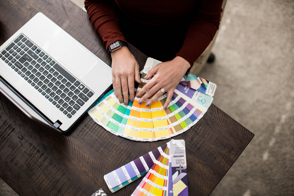
My favorite part of designing brands is creating the color palette. Color has a great deal to do with our mood towards something. Colors are in fact very powerful and are a big part of the branding process. When working with my clients, these are the things we consider as we develop and use the color palette.
-
What mood do we want to convey? I have all my clients complete a brand questionnaire which helps us focus on their target audience and what we want the overall vibe of their brand to be. Is it feminine and soft? Or, is it bright and full of energy? I use color psychology when developing color palettes. Different colors have different associations. For instance, green is associated with nature and health while yellow evokes feelings of joy and optimism. In order to create a color palette that attracts your ideal client, we have to consider mood, tone, and color psychology.
-
How many colors does a brand need? No two clients are the same but I’ve found the sweet spot for number of colors is five. In most cases, two colors will end up being the primary colors used most often in the branding while the remaining colors will be used to add some pops of color. Five colors gives a brand versatility and flexibility without looking chaotic. I provide my clients with three initial color palette concepts and we work together to narrow it down to the best set of colors.
-
How and where do we use the brand colors? I provide my clients with their colors in RGB and CMYK. RGB colors will be used for website backgrounds, social media graphics, or an other on-screen applications. CMYK colors should be used when printing items like business cards, stationery, stickers, etc. I recommend my clients have at least one darker tone in their palette. Darker colors are best for text on websites or sell sheets because they are easier to read. In contrast, lighter colors are great for backgrounds and patterns.
Choosing and Using Brand Color Palettes
Jul 12, 2019

Get in touch
contact me
Ready to get started on your brand design? Have questions about which package would be the right fit for you? Send me a note! I can't wait to hear from you!
ABOUT
follow along on the gram
SERVICES
©LAURA ANNE CREATIVE LLC 2024 | PRIVACY
contact
BLOG
Photos by kaitlyn LANGSToN PHOTOGRAPHY
Laura Anne Creative is a Minneapolis-based creative design studio specializing in brand design, Showit websites, and freelance graphic design services.